In today’s digital marketplace, your website is often the first point of contact with potential customers. First impressions matter – in fact, 94% of people’s initial impressions are based on web design alone. A well-crafted site can guide visitors toward taking action, while a poor design can send them away. That’s why as a Leading Web Design Company in Udaipur, we focus on the psychology behind every design choice. Each color, layout, and word is chosen to nudge the visitor closer to becoming a buyer.
Effective web design isn’t just about looking nice – it directly influences user behavior. Users spend more time, explore more pages, and are far more likely to convert when a site is easy to navigate and visually appealing. For example, including clear calls-to-action and intuitive layouts can lead a customer from casual browsing to making a purchase. Conversely, if visitors feel lost or distrustful, up to 88% of them will leave without acting. In this article, we’ll break down key design strategies rooted in psychology to help you turn visitors into loyal customers. We’ll also show how our team at Udaipur Freelancer applies these principles in our Website Development and E-commerce projects.
User Perception and First Impressions
A visitor’s mind processes a website’s design almost instantly. People take in colors, images, and layouts in a matter of milliseconds – long before they read the first line of text. This split-second judgment determines if they stay or bounce. Visual hierarchy is critical: users tend to scan pages in an 'F-shaped' pattern, focusing first on the top left and upper areas. By placing your most important content (headlines, products, CTAs) along these focal zones, you capture attention right away.
Visual hierarchy: Studies show people read web pages in an F-shape (horizontal lines at the top, then down the left). Place your key offers, headlines, and buttons where the eye naturally goes – typically the upper-left, top, and center of the page.
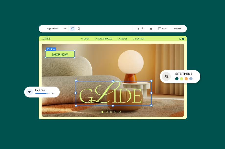
To reinforce this, keep your design clean and uncluttered. Hick’s Law from psychology tells us that too many choices overwhelm users. In practice, this means simplifying menus and call-to-action buttons. For instance, limit your menu items or split them into clear sections so users aren’t forced to decide among dozens of options. We often apply this at Udaipur Freelancer by using clear, obvious CTAs like 'Get a Quote' or 'Buy Now,' while hiding less important links in secondary menus. This directs the visitor’s mind along an easy path, reducing confusion and increasing clicks on the actions you want them to take.
Another guiding principle is Fitts’ Law, which says clickable elements should be large enough and close enough to the user’s cursor or finger to make clicking easy. In our web designs, we ensure buttons and forms are prominent and spaced so that visitors can’t miss them. For mobile users (who are now over 64% of all internet traffic), this means thumb-friendly button sizes and responsive layouts. Speaking of mobile, a mobile-friendly, fast-loading site isn’t optional anymore – it’s expected. Research shows that a site that loads quickly and scales to smartphones keeps users engaged, boosting both conversions and SEO.
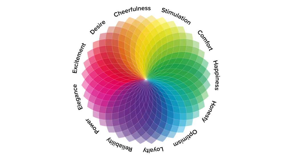
Color Psychology and Emotional Triggers
Color is one of the most powerful tools in web design. Surprisingly, around 85% of consumers say color is their primary reason for why they buy a particular product. Different hues subconsciously trigger emotions. blue often conveys trust and calm, making it a great choice for finance or tech sites, while red or orange can create excitement or urgency (think of a big red Buy button).
Tip: Use color to communicate your brand emotion. Warm, intense colors (red, yellow, orange) grab attention and can prompt quick actions, while cool colors (blue, green) build trust and make users feel at ease
We put this into practice at Udaipur Freelancer by choosing accent colors that match each client’s brand and goals. For example, an e-commerce client who wanted to create urgency saw us use a vibrant orange for 'Add to Cart' buttons. This contrast made the button stand out against a neutral background, tapping into the psychology of urgency. In contrast, a trust-oriented site (like a medical or legal firm) might get a design with cool blues and greens to project reliability.
Color also guides the eye through the site. A well-placed, brightly colored call-to-action (CTA) button will stand out against the rest of the page, signaling click me. Combine this with white space around the element to reduce distractions and you have a powerful prompt. In short, the right color palette can make visitors feel exactly the way you want when they see your site.
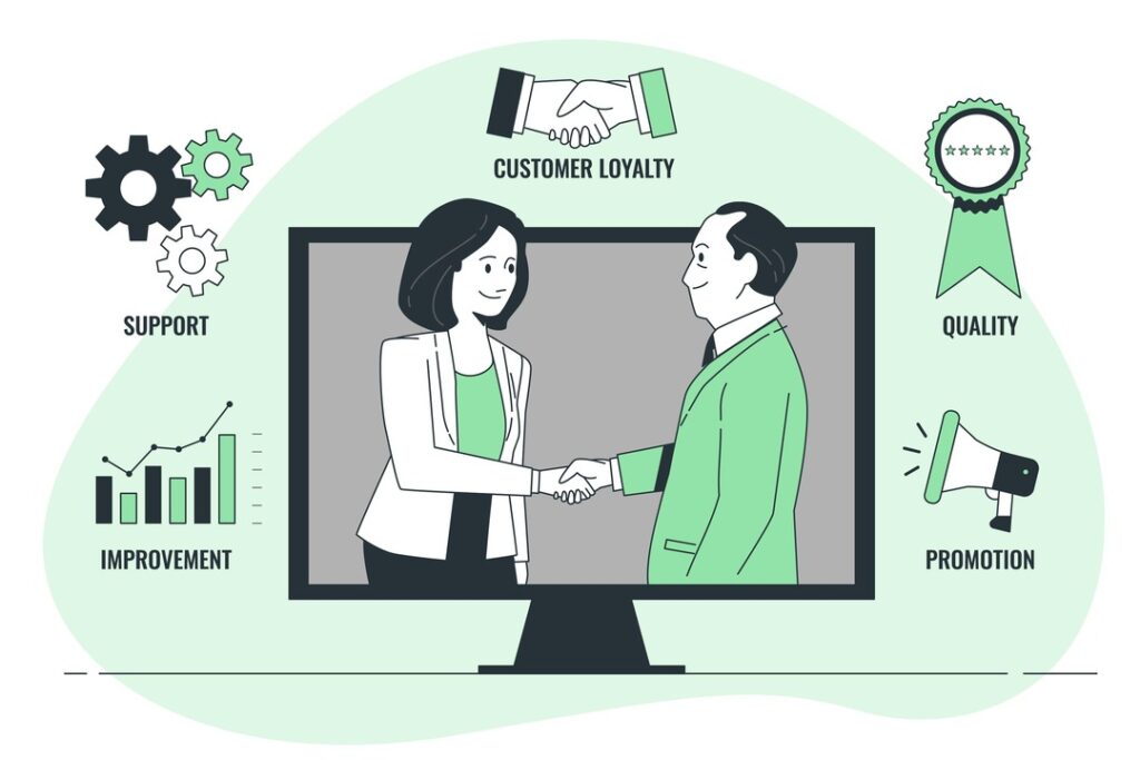
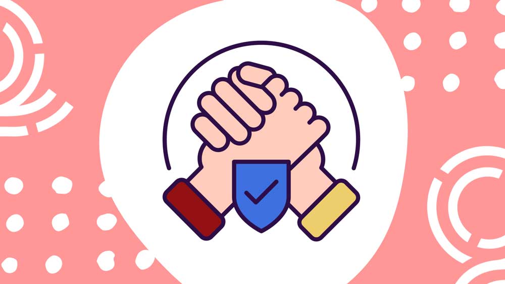
Building Trust and Credibility
Before a visitor becomes a customer, they need to trust you. Design plays a huge role in trust-building. A professional-looking website immediately conveys credibility. On the flip side, if a site looks amateur or cluttered, people will hesitate – one study noted that 9 out of 10 customers trust user reviews over company claims. That’s why we make social proof front and center.
Testimonials and Reviews: Display real customer reviews and testimonials where users can see them. As psychologists call it, social proof tells new visitors people like you have done this and benefited. On client sites we build, we include testimonial sections and case study highlights. Studies back this up: showing reviews on your site can boost trust dramatically.
Trust Badges: Security seals (like SSL or payment processor logos) and industry certifications also comfort users. Data shows forms with trust badges (secure checkout logos, money-back guarantees) convert up to 42% better than forms without them. Whenever we develop e-commerce or lead-gen sites, we add these badges near sign-up forms and checkout buttons to ease buyer anxiety.
Consistent Branding: A cohesive color scheme, font style, and imagery across the entire site (and marketing materials) looks much more professional. This consistency reduces cognitive friction and signals to visitors that your business is organized and dependable.
In practice at Udaipur Freelancer, we see this pay off. For example, one of our local clients was a retail store that added customer testimonials and a secure checkout badge to their checkout page. They reported a noticeably higher completion rate at checkout – proof that small trust signals can make a big difference.
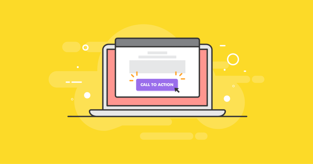
Clear Messaging and Calls-to-Action
Good design amplifies good copy. Once a visitor trusts your site, they need a clear reason and way to act. This means straightforward headlines and obvious next-steps. We follow Occam’s Razor in design, don’t complicate things. Each page should have one main goal – whether it’s Buy Now, Sign Up, or Learn More. By focusing on a single primary call-to-action per page, we prevent users from getting distracted.
For example, on a service page we might have a big button Get a Free Quote near the top and again at the bottom, rather than bombarding the visitor with multiple unrelated offers. The Thrive Agency analysis highlights how critical this clarity is, a strong, intuitive CTA paired with good UX can more than double conversion rates. In our designs, we use action-oriented text (Start Your Project, Claim Offer) and position buttons where the eye naturally falls (upper-right or after a convincing section of content).
We also respect Hick’s Law here by not presenting too many choices. Instead of listing ten products on the homepage, we feature best sellers or recommended for you, guiding the user’s decision. This funnels visitors smoothly toward a choice rather than paralyzing them with options. User testing often bears this out, when we simplify options, click-throughs on the intended CTA consistently rise.
Here is a quick checklist we use for every page:
One Clear Goal: Each page has a primary purpose (e.g. collect leads, sell a product).
Focused Content: Headings and paragraphs are concise and skimmable. Bullet points highlight key benefits.
Visible CTA: Buttons or forms use standout colors and appear above the fold (no scrolling needed).
Answer Objections: Use subheadings or trust text ('100% Secure Checkout', '30-Day Money Back') near CTAs to preempt doubts.
By following these steps, you create a clear path from visitor to customer.
Emotional Design and Storytelling
Beyond mechanics, people connect with stories and feelings. A website that tells a story about its brand or product helps visitors imagine using it themselves. We often recommend using real photos of people (team members or satisfied customers) instead of stock images whenever possible. Seeing human faces creates familiarity.
There’s more to life than simply increasing its speed.
By Udaipur Freelancer
Consider Amazon’s checkout page: it’s simple and data-driven, but they also emphasize reviews (social proof) and highlight product benefits (Amazon’s Choice) to create trust. Even elements like the shopping cart icon or an animated 'add to cart' effect are small psychological nudges. In practice, we might add micro-interactions (like a slight button animation on hover) to make the experience feel more interactive and alive. These tiny details reassure users, the site is responsive and up-to-date.
We also use storytelling copy. For example, rather than Our Services we might say “How We Help [Target Customer]”. Phrases like “Join the many [local businesses / customers] who have grown with our help” tap into a user’s desire to belong. This aligns with the Zeigarnik Effect, where people remember incomplete narratives. By starting a story (“When we started, we saw entrepreneurs struggle with…”) and then resolving it (“That’s why we developed this solution…”), visitors stay engaged and want to see the outcome – often by clicking a CTA.
Trust Signals and Testimonials
Nothing speaks louder than the voices of happy customers. We regularly integrate testimonials and case studies into client websites. These user-generated stories carry a lot of weight, industry surveys find that about 90% of people trust a testimonial more than a company’s own claims. In fact, one report showed that watching a single video testimonial convinced 77% of viewers to purchase and overall lifts conversions by up to 34%.
For example, on a recent client site, we added a Success Stories section highlighting how a small Udaipur retailer doubled its sales after a site makeover. Just seeing a real result from another local business helped new visitors take action. These testimonials were placed next to call-to-action buttons for extra impact (e.g. right above 'Book a Demo'). Since adding them, that client reported more quote requests and lower bounce rates.
In summary, to build trust through design:
Show real user feedback: Quotes, ratings, or star reviews next to products or on landing pages.
Visual proofs: If possible, include actual customer photos with testimonials. Video snippets (even short ones) are even more engaging.
Statistics: A quick stat ('Trusted by 500+ clients' or 'Over 10,000 products sold') adds credibility.
We then link these testimonials and trust badges directly to the relevant call-to-action. For instance, after a glowing quote about easy signup, the Get Started button stands out. This end-of-page reinforcement often nudges hesitant visitors to convert.
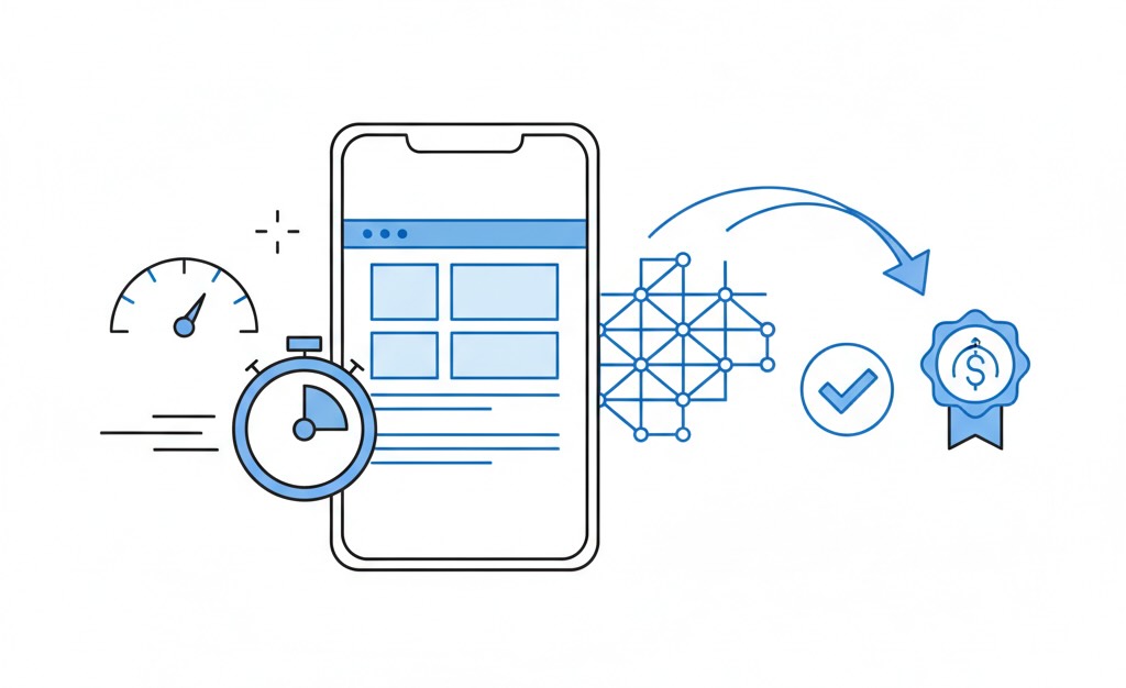
Mobile & Performance: Speed Matters
By now, the majority of web browsing is on phones and tablets. In fact, 64% of global web traffic comes from mobile devices. If your site isn’t fast and optimized for a smartphone, you’ll lose those visitors. We always use responsive design to ensure layouts adapt, but we go further, images are compressed, code is minified, and server response times are tuned. According to Think with Google, 53% of mobile users abandon a page that takes longer than 3 seconds to load. Keeping load times under control directly improves conversions.
Buttons and menus must also work well on touchscreens. we give them enough space and size so fat-finger taps don’t trigger the wrong link. Input forms are simplified (fewer fields, bigger input boxes) for mobile. By treating mobile users as a priority, many of our clients have seen a jump in mobile conversions – sometimes by over 30% after a redesign.
Finally, we link these fast, mobile-friendly sites with our digital marketing and SEO services. Good design drives traffic, and great marketing ensures that traffic is qualified and eager. Together, visitors are more likely to turn into paying customers.
Real-world Results and Case Studies
All these principles are backed by data. For example, a Conversion Sciences case study found that by methodically testing design changes (headlines, button text, images), one client saw a 250% increase in leads in just six months. They didn’t guess – they tested multiple versions of each page element until the design that performed best was live.
Similarly, Thrive Agency reports that when businesses improve UX/UI, they can boost conversions by over 200% on landing pages. Simple steps like reducing clutter, adding trust signals, and clarifying CTAs turned a slow-converting site into a high-converting one. We see this often with our clients, too. After launching new designs for a Udaipur startup, their signup rate doubled within the first three months, according to their analytics.
At Udaipur Freelancer, every design project begins with user research and A/B testing whenever possible. We measure engagement (time on page, click rates) and iterate. Over time, this data-driven approach allows us to refine a site’s design until the psychology works in favor of our clients.
Why Work with a Web Design Company in Udaipur
Choosing a local expert like Udaipur Freelancer adds another psychological advantage, local relevance. We understand the Udaipur market’s nuances – from cultural aesthetics to local language touches – that can make your site feel more familiar and trustworthy to regional visitors. On top of web design, we also offer E-commerce Development and Mobile App Development services. This means we can create a seamless brand experience across your website, online store, and even mobile app, all grounded in the same strategic thinking.
We also build basic SEO foundations into every design (fast loading, mobile-friendly, clean code) and can link your site to our digital marketing services. In our experience, sites that use these psychology-based design techniques and good SEO see a compounded effect, more traffic and a higher percentage of visitors buying or signing up.
Key Takeaways
Make a strong first impression: Your design is almost your entire first impressiong. Use clear layouts and priorities to grab attention.
Use color and images intentionally: Up to 85% of buying decisions are driven by color. Warm colors for urgency, cool for trust – always align with your message.
Build trust: Show testimonials, trust badges, and real credentials. Remember: almost 90% of people trust other customers’ opinions more than company claims.
Keep it simple: Reduce choices and jargon (Hick’s Law), use large clickable targets (Fitts’ Law), and highlight one main action per page.
Optimize for mobile and speed: With 64% of traffic on mobile, a slow or unresponsive site loses sales. Fast, responsive sites convert higher.
Test and measure: Small changes can have big impacts. Continually test headlines, button colors, and page layouts – the results may surprise you.
Strategic web design is both art and science. By applying psychology-based design – from intuitive layouts and emotional colors to strong trust signals and clear CTAs – you guide visitors down the funnel. The result? More leads, more sales, and more customers who trust your brand. If you’re ready to transform your website into a high-converting asset, our team at Udaipur Freelancer is here to help. Contact Us Today for a free consultation and see how we turn visitors into loyal buyers.
Udaipur Freelancer delivers high-quality web, marketing, and design solutions. We focus on building impactful digital experiences that help your brand succeed in today's market.


Recommended for you
Must-See Art Exhibitions Around the World This Year
The Revival of Classical Art in a Digital Age
Breaking Down the Elements of a Masterpiece Painting
The Revival of Classical Art in a Digital Age