Modern businesses must prioritize mobile-first web design. Over half of global internet traffic is now mobile – and in India that figure is even higher. This shift means mobile experience directly impacts conversions, SEO ranking, and customer satisfaction. In this post, we explore recent mobile usage statistics globally and in India, explain why a mobile-first approach is crucial, and provide actionable guidance. We’ll include local context for Udaipur (a booming tourist market), two mini case studies with tangible results, a step-by-step implementation checklist, recommended tools, on-page SEO tips (including keyword density and LSI keywords), and image/chart suggestions. By the end, you’ll understand why ignoring mobile-first design is risky – and how Udaipur Freelancer (a Leading web design company in Udaipur) can help your business adapt and thrive in a mobile-dominated world.
Introduction
Mobile devices are no longer an afterthought – they’re the primary way people browse the web today. In 2025, about 62–68% of internet traffic came from smartphones and tablets. In India specifically, mobile accounts for roughly 68% of web visits, compared to just 32% on desktops. Meanwhile, 806 million Indians are online (55.3% of the population), and there are 1.12 billion cellular connections (about 76.6% of the population). These numbers have grown steadily year-over-year as smartphones became ubiquitous.
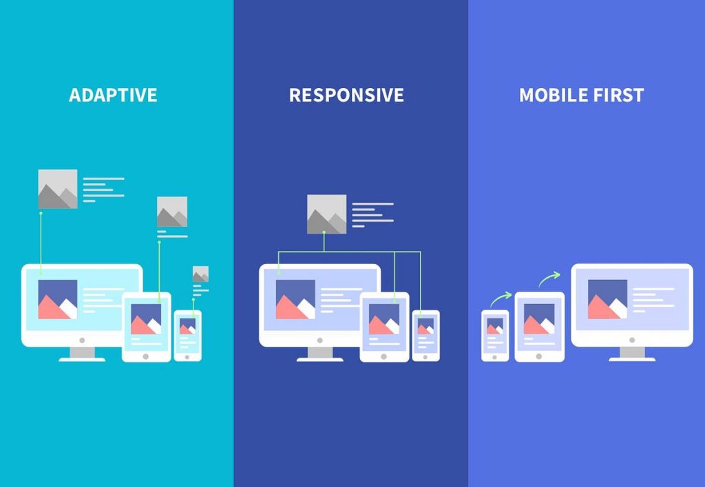
In this context, mobile-first web design is the practice of designing a site’s layout, content, and performance with the mobile (small-screen) experience as the priority. Instead of treating mobile as an afterthought, designers start by optimizing for smartphones and then scale up for larger screens. For modern businesses, especially a local company like Udaipur Freelancer – Web Design Company in Udaipur, adopting mobile-first design is non-negotiable. It ensures your customers (many of whom browse on phones) have a fast, user-friendly experience – which boosts conversions, SEO, and brand trust.
This post will dive deep into why mobile-first design matters (with data to back it up), how it impacts user behavior and SEO, and how your business can implement it step by step. We also include two brief case examples (one from India/Udaipur context) demonstrating measurable improvements from mobile-optimized redesigns, plus a practical checklist and resource guide. Finally, we’ll show how Udaipur Freelancer can be your local partner in this process.
Why Mobile-First Matters: Trends & Statistics
The evidence is clear: mobile is dominating the web. As of early 2025, 5.78 billion people (70.5% of the world’s population) use a mobile phone, and 5.56 billion people (67.9% of the global population) use the internet. Mobile connections have grown faster than population, meaning many users have more than one SIM (e.g. for work and personal use). Smartphones account for almost 87% of mobile handsets worldwide, underscoring that mobile web essentially means smartphone web.
Globally, mobile web traffic is now the majority. A StatCounter analysis shows mobile devices (including tablets) made up about 52.3% of global web traffic in early 2026, up from just a few percent a decade ago. Another chart reports 60.5% mobile vs. 39.5% desktop share in mid-2025 – reflecting that mobile use has leveled off around 60-65%. Even conservative sources say roughly 62–63% of global web traffic is mobile. Meanwhile, desktop usage (while still important in some industries) hovers around 35-40%.
In India, the gap is even bigger. StatCounter reports 68% of India’s web traffic is mobile (only 32% on desktop). For context, India has over 800 million internet users now, but also one of the highest mobile-first habits (60+% mobile traffic). This means businesses targeting Indian customers should expect most of their visitors to be on phones. (India is among the top countries by search volume, behind only the US and China – and India’s % mobile usage in search is around 75%.)
A quick comparison table:
Metric
Global (2025)
India (2026)
Sources
Internet users
5.56 billion (67.9% of pop)
806 million (55.3% of pop)
DataReportal
Mobile web traffic share
~60–62%
67.98%
Statcounter
Desktop share
~38–40%
32.02%
Statcounter
Mobile connections
N/A
1.12 billion (76.6% of pop)
DataReportal/GSMA
Smartphone usage
~5.78 billion (70.5% of pop)
(Not stated)
Kepios / DataReportal
Mobile conversion rate (e-commerce)
~2.8%
(No exact India stat)
Dynamic Yield via SmartInsights
It’s no surprise that more people browsing on mobile means businesses must be mobile-friendly. If your site still prioritizes desktop users, you’re missing out on a huge chunk of traffic – and Google may rank you lower (more on SEO below).
Mobile vs. Desktop User Behavior & Conversions
It’s not just raw traffic share – mobile and desktop users behave differently. Studies show mobile traffic tends to have higher bounce rates and shorter sessions than desktop, because phones are often used on-the-go for quick tasks. Desktop users typically have longer sessions and higher average order values, especially for complex purchases. For example, one industry report found desktop shoppers have 1.3–1.8x higher conversion rates than mobile shoppers in retail, even though mobile drives 65–75% of site traffic. Similarly, conversion benchmarking by Dynamic Yield (Mastercard) saw mobile conversion ~2.8% vs desktop ~3.2% – about a 1.7x gap, since people often browse on mobile but actually buy on desktop.
But caution: even if desktop conversions are higher per session, the volume of mobile traffic makes it too important to skip. According to one source, mobile had 313% more visits than desktop in 2023, so overall revenue from mobile can still be huge. In sectors like local search and micro-moments (directions, quick info), mobile is the front door – Google notes over 80% of near me queries come from phones. In short, desktop users spend more time and buy bigger ticket items, but mobile users outnumber them and often do the initial discovery or quick tasks.
The Performance Factor: Speed & Conversion
Mobile devices vary widely (old phones, spotty networks), so speed matters even more on mobile. Slow pages are killers: Google itself reports that 53% of mobile visitors abandon a page if it takes longer than 3 seconds to load. More broadly, studies find that every second of delay can cut conversions by ~7%, and bounce rates skyrocket (bounce +32% going from 1s to 3s, +90% from 1s to 5s). In India’s context, where many users are on 4G or even 3G networks, optimizing load times and reducing page weight (images, scripts) is critical. A single 1-second speedup on mobile can improve conversions by ~8.4% – a tangible difference for a business.
Key takeaway: Mobile-first design isn’t just about arranging content nicely on a small screen – it means prioritizing performance and ease of use for mobile users. That drives real business results: one Indian case study showed that improving a site’s mobile UX and speed led to a jump from 0.8% to 3.2% conversion rate, taking monthly revenue on the same traffic from ₹5L to ₹20L. (That’s an extra ₹15L/month just by optimizing the experience.) We’ll detail more examples below.
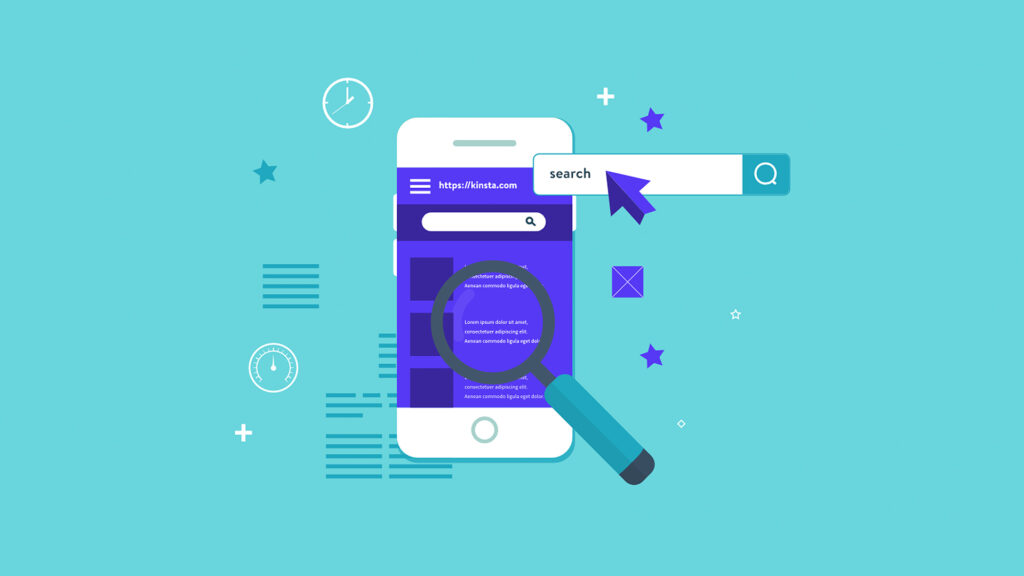
Why Google and SEO Love Mobile-First
Google famously switched to mobile-first indexing a few years ago. This means Google predominantly uses the mobile version of your site when crawling and ranking pages. If your mobile site is thin, slow, or different from the desktop, you’ll get less SEO credit. A mobile-unfriendly site can hurt your search visibility, traffic and ultimately conversions.
SEO factors boosted by mobile-first design:
Page Speed: Google’s algorithms favor fast-loading pages, especially on mobile. A mobile-first approach forces you to optimize page size and performance (e.g. compress images, streamline code). This improves Core Web Vitals (LCP, FID, CLS), which are official ranking signals.
Usability Signals: Bounce rate and time-on-page are indirect SEO signals. If mobile users bounce off a slow, clunky site, Google sees that as a bad UX. Mobile-optimized sites tend to keep users engaged longer. (As noted, bouncing skyrockets if load times hit 3-5 seconds.)
Content Parity: Mobile-first design often forces you to re-prioritize content (show the most important info up front). Having the same content on mobile and desktop (e.g. not hiding text behind a 'read more' mobile-only button) ensures Google can index all your valuable content.
In practical terms, if you search for “Web Design Company in Udaipur” on Google, a site that is mobile-friendly and fast will outrank a clunky one, all else equal. Google’s own benchmarks show nearly three-quarters of UX factors are tied to page speed. So, investing in mobile-first design is also investing in your search rankings and organic lead flow.
There’s more to life than simply increasing its speed.
By Udaipur Freelancer
Benefits of Mobile-First Design for Businesses
Improved Conversions: A site that works great on phone makes it easier for mobile visitors to act. Buttons are large enough to tap, forms fit the screen, and key CTAs (like 'Buy Now') are prominent. This smooth path can dramatically boost inquiry rates. For example, a local education consultancy saw inquiries jump from 1.2% to 4.7% just by changing a CTA and focusing on mobile usability. Across industries, businesses that adopt mobile-first strategies consistently see higher conversion upticks.
Wider Reach: With ~68% of Indians on mobile devices, you simply can’t afford to alienate that audience. A mobile-first site can reach customers in places they browse (on commute, in markets, etc.), tapping into otherwise lost opportunities.
Faster Pages = Better Retention: Mobile-first design usually means simpler layouts and optimized assets. That speeds up load times (aim <3s on 4G), reducing bounces. Faster pages also keep Google happy, as noted.
Future-Proofing: Screen sizes and devices keep evolving (foldables, wearables, etc.). A mobile-first mindset (responsive, flexible design) means your site adapts to any new device without a complete redesign.
Competitive Advantage: In Udaipur and India, many small businesses still lag on mobile-friendliness. By going mobile-first, you differentiate yourself: travelers and shoppers will appreciate a site that just works on their phone. This can be a selling point in pitches and marketing.
Better Branding and Trust: A slick mobile experience conveys professionalism. It shows you care about the customer’s convenience. Trust signals (testimonials, certifications, etc.) can also be easily integrated into mobile-friendly layouts. Tourists in Udaipur, for instance, often research hotels on phones – one study shows 90% of guests research hotels online before booking – so a well-built mobile site is like a 24/7 front desk for your brand.
By contrast, ignoring mobile-first is costly. One report estimates poorly optimized sites cost Indian SMEs ₹50,000 crore per year in missed opportunities (with '7 out of 10 Indian business websites facing a conversion crisis' due to factors like bad mobile UX). The cost is real revenue slipping through the cracks.
Case Studies / Examples (with measurable outcomes)
Case Study 1: Manufacturing Co. (Pune, India)
A medium-sized industrial manufacturer revamped their website with mobile-first design principles and conversion optimization. Before: 2,500 monthly visits, 0.8% conversion (~20 inquiries) from site forms. After the redesign: 3.2% conversion (~80 inquiries). With the same visitor count and sales process, their monthly revenue jumped from ₹5,00,000 to ₹20,00,000 – an increase of ₹15,00,000 per month (₹1.8 crore per year). In other words, by making their site mobile-friendly, simplifying navigation and CTAs, and speeding up load times, they quadrupled their sales leads.
Case Study 2: Udaipur Hotel (Hypothetical Local Example)
Outcomes: Booking conversion rate increased significantly (clients reported roughly 2x in some cases) by focusing on mobile UX and speed. The site now attracts more mobile traffic and direct bookings (72% of guests prefer direct mobile booking), reducing reliance on costly OTAs.
These examples underline a pattern: mobile-optimized sites convert better. And in a city like Udaipur, where tourists rely on phones for research and bookings, the gains can be even higher.
Step-by-Step Mobile-First Implementation Guide
Here’s a practical roadmap for any business (e.g. via your web design company in Udaipur) to implement mobile-first design:
Audit Current Site: Check analytics to see what percentage of your traffic is mobile. Note your mobile conversion rate vs desktop. Use tools like Google Analytics and Google Search Console. This baseline helps set goals.
Define Content Priorities: Mobile screens are smaller. List your top 3 user goals (e.g. 'book a service', 'contact us', 'view portfolio'). Make sure these are front-and-center on mobile. Prioritize content – put key info (headline, value prop, CTA) at the top.
Wireframe Mobile Layouts: Sketch or use a tool to design the site’s mobile layout first. Focus on thumb-friendly buttons, simple navigation (hamburger menu or bottom tabs), and clear hierarchy. For example: Timeline of Mobile-First Design Process:
flowchart TD
    A[Identify business goals] --> B[Analyze visitor data & devices]
    B --> C[Plan content hierarchy for mobile]
    C --> D[Design wireframes for mobile-first]
    D --> E[Develop responsive website]
    E --> F[Test on multiple devices & networks]
    F --> G[Optimize (speed, UX) & deploy]
    G --> H[Monitor analytics & iterate]
Above: a simplified mobile-first workflow (from goal-setting to launch) in Mermaid flowchart format. This ensures the process is clear and iterative.
Design Visually Mobile-Friendly: Use clean, legible fonts and large touch targets. Avoid tiny menus; instead use collapsible menus or sliders. Keep designs simple – too many images or elements slow down phones. Use CSS media queries or a responsive framework (like Bootstrap) to adapt to screen sizes.
Optimize Performance: Compress and lazy-load images. Minify CSS/JS. Use caching (CDN, browser caching). Aim for load times <3 seconds on typical 4G/5G networks. (Remember Google’s stat: 53% abandon >3s.) Test with tools like Google PageSpeed Insights or Lighthouse.
Mobile SEO Considerations:
Ensure the mobile site has the same content as desktop (no hidden text).
Use a responsive design (one URL) rather than a separate 'm.' site if possible.
Add structured data (e.g. local business schema) for mobile search.
Optimize meta tags and alt text for images (see below).
Test Real Devices: Emulators aren’t enough. Test on a variety of real smartphones/tablets (especially Android phones common in your audience). Check usability: Can you tap all links? Is text readable without zooming? Does the booking form work smoothly?
Launch & Monitor: After deploying the mobile-first design, continue to monitor mobile bounce rates, session duration, and conversion rates in Google Analytics. Compare against your baseline to quantify improvements. Use tools like Hotjar or Google Analytics 4’s event tracking to see how users scroll and click on mobile.
Mobile-First Checklist: (for quick reference)
All key menus and buttons are easily tappable.
Page load time is under 3 seconds on mobile (score ≥85 on PageSpeed Insights).
Content is prioritized: critical info and CTAs appear first.
Images are optimized (compressed, properly scaled) with descriptive alt text (e.g. “Screenshot of new mobile-optimized home page for Udaipur hotel”).
Responsive design: site adapts to different screen sizes without horizontal scrolling.
Metadata and structured data are set (including local keywords for Udaipur context).
Analytics and Search Console tags updated and tested (ensure the mobile site is indexed).
Tools & Resources
To help implement mobile-first design, consider these tools:
Category
Tool/Resource
Purpose
Design & Prototyping
Figma, Adobe XD
Create and test mobile wireframes and mockups.
Responsive Frameworks
Bootstrap, Tailwind CSS
Pre-built responsive components & utilities.
Performance Testing
Google PageSpeed Insights
Analyze mobile page load times and get improvement tips.
Quick on-desktop test of various smartphone viewports.
Real Device Testing
BrowserStack, LambdaTest
Cloud-based testing on actual device browser combinations.
Mobile SEO
Google Mobile-Friendly Test
Checks page for mobile usability issues.
Screaming Frog SEO Spider
Crawl site to ensure mobile content/metadata present.
Analytics
Google Analytics 4 (GA4)
Track mobile vs desktop user behavior and conversions.
Hotjar / Microsoft Clarity
Visualize mobile user sessions (heatmaps, scroll).
Images & Media
TinyPNG / ImageOptim
Compress images for faster load.
webpconvert, Squoosh (Google)
Convert images to modern formats (WebP, AVIF).
Documentation
MDN Web Docs (Responsive Design)
Guides on CSS media queries, flexible layouts.
Use these tools to streamline each step: for example, bootstrap or tailwind will handle much of the responsive layout for you, while PageSpeed Insights will flag any remaining speed bottlenecks. Combined with user testing on real phones, this ensures your mobile design is polished.
On-Page SEO Elements (Keyword Usage, LSI, Alt Text)
Target Keyword Usage: Aim for around 1-2% keyword density for “Web Design Company in Udaipur”. (E.g. ~15–30 uses in a 3000-word post.) Use it in the title, some headings, intro, and conclusion. Also sprinkle it naturally in body text (e.g. “Our Web Design Company in Udaipur specializes in mobile-first design”).
LSI Keywords: Include related terms to help SEO and readability. Good ones here are 'mobile-first design', 'responsive web design', 'mobile optimization', 'user experience', 'smartphone browsing', 'page speed', 'conversion rate optimization'. For example: 'Mobile-friendly sites improve user experience on smartphones and tablets,' or 'We focus on mobile optimization to improve SEO.'
Headings: Use H2/H3 with related phrases (e.g. 'Mobile-First Design Benefits', 'Impact on Conversion Rate') to improve topical relevance.
Alt Text Examples: For images, always write descriptive alt text. E.g. 'Pie chart showing 62.7% global internet traffic via mobile vs 35.4% via desktop (Statista).' or 'Diagram illustrating a mobile-first website design process: from wireframing on smartphone to deployment.' Alt text should include relevant keywords if it makes sense (like mobile or mobile-friendly).
Suggested Images/Diagrams
Global Traffic Chart (Pie/Bar): As above, a pie chart of mobile vs desktop traffic. This visually reinforces data such as 62.7% mobile.
Mermaid Flowchart: (As shown) a flowchart of the mobile-first design process. Many static site generators (like Docusaurus) can render mermaid.
Infographic: An infographic like [52] at the top to catch attention.
PageSpeed Diagram: A simple line or bar chart showing conversion rate vs page load time (e.g. from [31]’s data: conversions drop 7% per 1s). You could generate a quick chart or find a licensed image illustrating speed vs bounce.
Local Example Visual: For the Udaipur hotel case, maybe an image of Udaipur tourism or a hotel (with alt text mentioning mobile booking) to localize content.
(Note: When embedding images, cite them with [像] at start of paragraph as per guidelines, and add alt text in italics below them.)
Internal Link Suggestions
To improve site navigation and SEO, link relevant anchor text to your site’s pages. Examples (adjust to your URL structure):
Responsive web design services – can link this anchor to your Services or What We Offer page to highlight your mobile and responsive design offerings. Place it when discussing mobile-optimized design services.
Our portfolio – anchor 'responsive design portfolio' or 'featured projects' to a portfolio or case studies page showing past mobile-friendly sites. Use this after a section on successful projects or case studies.
Contact us – link text like 'contact Udaipur Freelancer today' or 'get in touch' at the end as a call-to-action to your contact page.
Learn more – could be 'learn more about our custom web development' linking to a blog or service page.
Local SEO services – if you mention optimizing for Udaipur search, link to any SEO or Digital Marketing page.
Conclusion & Call to Action
In today’s mobile-driven world, mobile-first web design is essential, not optional. The data is undeniable: most customers find and interact with businesses on their phones. By prioritizing the mobile experience through fast performance, intuitive design, and responsive layouts you boost engagement, conversions, and search visibility. Conversely, neglecting mobile leads to lost customers. For modern businesses in Udaipur and beyond, going mobile-first means staying competitive and capturing those digital opportunities.
Ready to make your website mobile-first? Udaipur Freelancer, a Leading Web Design Company in Udaipur, can help. Our team specializes in creating fast, responsive websites tailored for mobile users. Whether you’re a local retailer, hotel, or service provider, we’ll ensure your site works beautifully on every device. Contact Udaipur Freelancer Today to get started on a mobile-first redesign and watch your conversions grow.
“With our mobile-first approach, your business won’t just meet modern standards it will set them. Let’s build something great together!” – Udaipur Freelancer Team.
On-Page SEO Quick Tips
Keyword Density: Aim for 1–2% usage of “Web Design Company in Udaipur” (roughly 15–30 mentions in 3000+ words). Include it in title, at least one subheading, intro, conclusion, and sprinkled naturally.
Use LSI Keywords: Sprinkle related terms like responsive design, mobile optimization, mobile UX, smartphone website throughout.
Meta Elements: The Meta Title and Description above are optimized for our keyword and entice clicks. For example:
Meta Description: “Learn why mobile-first web design is crucial for modern businesses. Mobile now drives 60%+ of web traffic. Discover key stats and tips from Udaipur Freelancer (your Web Design Company in Udaipur).”
Headings & Structure: Use H2/H3 headings with relevant terms (e.g. 'Benefits of Mobile-First Design' or 'Mobile vs Desktop Traffic' include mobile).
Internal Links: As suggested above, add 3–5 internal links using relevant anchor text (like responsive design services, portfolio, contact us) to enhance SEO and user navigation.
By following these SEO guidelines and designing mobile-first, your blog post and your website will be well-optimized to reach more customers and rank higher in search results.
Udaipur Freelancer delivers high-quality web, marketing, and design solutions. We focus on building impactful digital experiences that help your brand succeed in today's market.


Recommended for you
Must-See Art Exhibitions Around the World This Year
The Revival of Classical Art in a Digital Age
Breaking Down the Elements of a Masterpiece Painting
The Revival of Classical Art in a Digital Age